How to Start a Lending Business, according to Boris Batine 94% of users don't trust a website with an outdated design, and yet you still can often see sites that look like they haven't been redesigned since the 90s. So when you start a lending business, the first thing you need to do after the paperwork is finished - is to build a website, or as we call it - an onboarding page. In terms of lead generation, the onboarding process is the most important one. Here are just a few convincing statistics:
- 42% of users leave a page if it has poor functionality
- 88% of people won’t return to a website after a bad user experience
- Great UX can increase your conversions by up to 400%
That’s why today we’ll focus on onboarding page design that will help you maximize conversions.
Psss... Wanna start lending within 45 days?
Top 10 tips for good onboarding from HES designers
#1. Focus users’ attention via single-column design
Why Do Lenders Prefer Software to Excel Loans Spreadsheets? When creating a loan company website, you need to focus all users’ attention on the most important thing - your offer. However, people’s attention and short-term memory aren’t perfect. According to research, people remember only 20% of what they read. When comparing single-column and multi-column layouts, studies show that people perceive the information placed in one column better and faster than in two. This happens because we have up to 5 different options on how to read the text located in two columns:
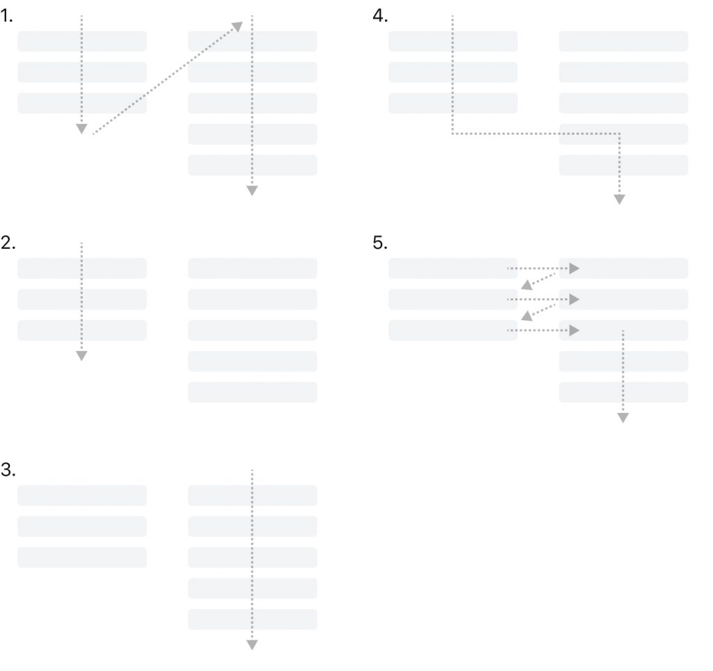
So when choosing a loan website design, it’s better to stop on the one-column layout.
#2. Highlight the most important details using contrast
79% of users scan a new page instead of reading it word-by-word. Using the principle of contrast, we can highlight the most important information and elements, so visitors won't miss them. In a nutshell, the bigger and the brighter the element is, the more attention it drives and the more important it looks. It’s vital to understand this principle when you need to place several components on the page and make sure they have the right relations and don’t conflict with each other.
#3. Choose “trustful” colors
Colors have always affected our emotions and brand perception since it's one of the most powerful communication tools in marketing and sales. Based on the Colorcom research, people need about 90 seconds to evaluate a product. Note that 62% to 90% of that evaluation builds on color only. According to color psychology, each color triggers specific emotions. For example, green and blue are normally associated with safety, security, and calmness, while red is more powerful and energetic. However, these associations can be different for every person and depend on age, sex, and cultural background. That’s why there is no universal answer to what colors to choose for your business loan website. To find the perfect-fit combination of colors exactly for your business, you can rely on professional UI/UX designers or after a series of tests and experiments.
#4. Create an emotional connection with the user via images
Before we jump into the landing page structure, we want to mention the images. There is a rule in design that you should be able to explain the main idea of the product using one image without any additional text. It may seem impossible in the financial domain, but you need to follow the rule while choosing the cover image. For example, if you offer mortgages, pick something that customers usually associate with real estate, not just happy smiling people.
By the way, when you've already selected several images, ask yourself: “what emotion do I feel when looking at it?” - because, through images, we create an emotional connection with the product and brand.
Now, let’s continue with the main elements of the good loan website.
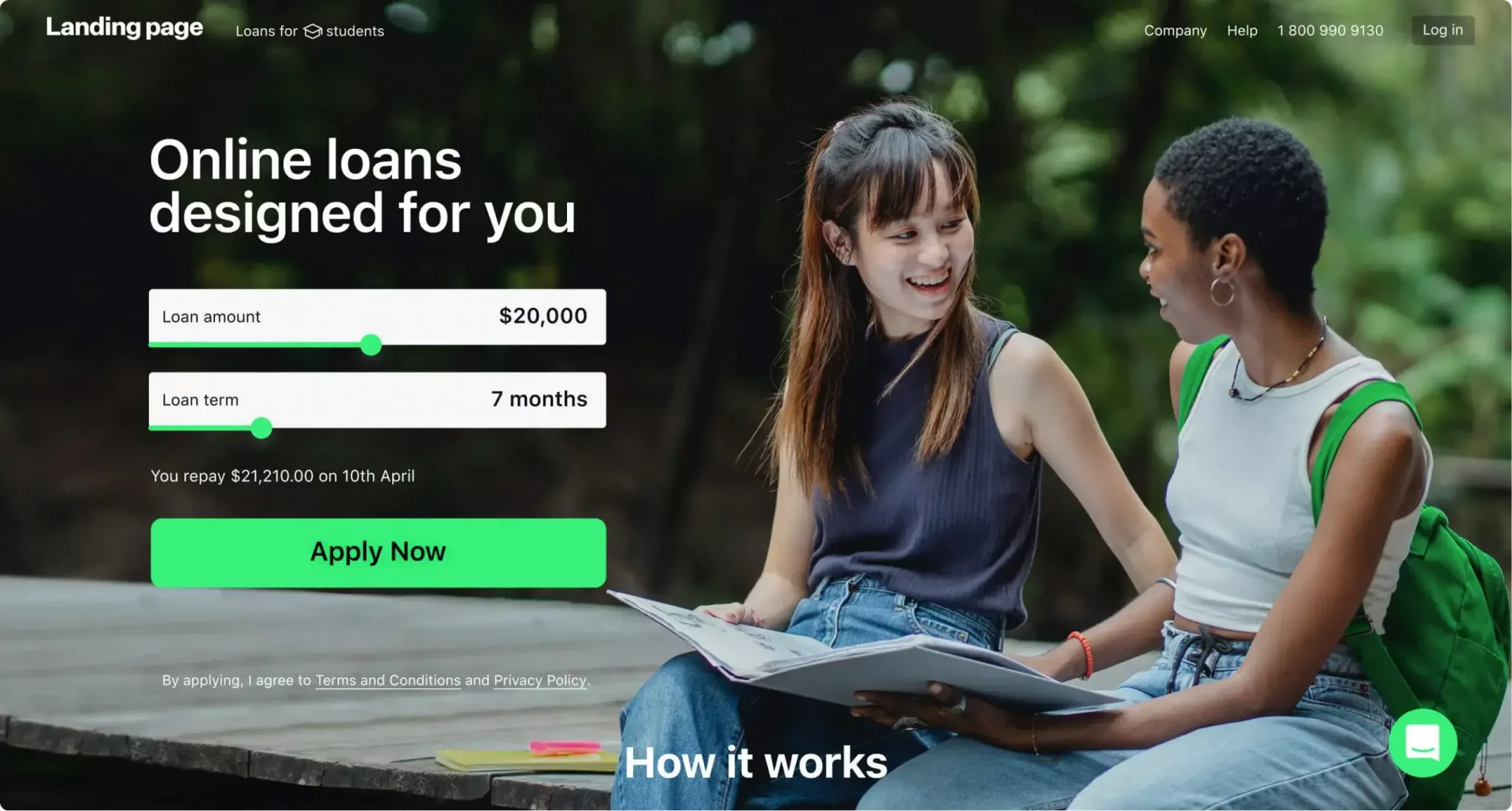
#5. Focus on the application form
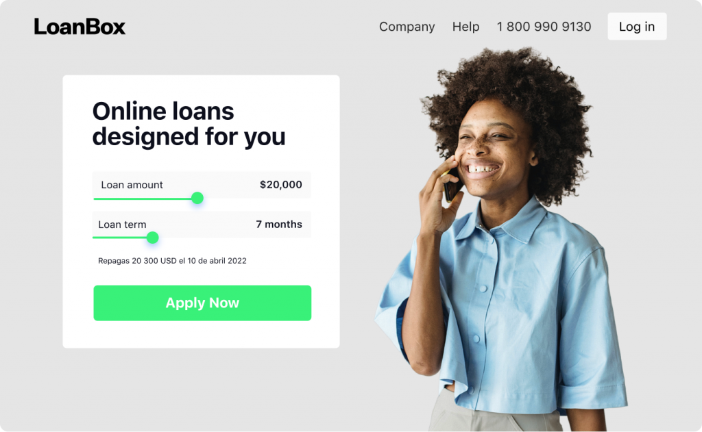
Meet HES LoanBox: Ready-to-Use Lending Platform A complex application form placed on the first screen is what differentiates lending businesses from other industries that normally locate them at the end of the landing page. On websites for loans, it usually looks like a calculator that visitors can use to understand how much money they can get. By clicking on the button, they are redirected to the loan application form.
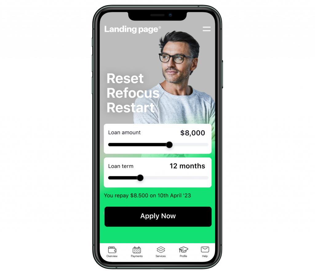
Here are three good practices:
- Split the application form into several steps and put each step on a separate page. It may be overwhelming to see a long list of fields you need to fill all at once, and it can scare people away. Studies show that implementing multi-step forms might increase conversions by up to 300%, even if you ask a lot of 'sensitive' questions like salary.
- Minimize the number of fields. It’s understandable that due to the specifics of the branch, the application form should be long. But whenever it’s possible to get the same info with less effort from a potential borrower, do this to simplify digital loan origination.
- Use auto-fill-in where it’s possible. For example, you can suggest phone codes or addresses via users’ IP and geolocation. But don’t forget that some people use VPNs for security purposes, and you need to let them double-check this information. Google research shows that users fill out the form 30% faster when the auto-fill-in feature is enabled. This fact, in its turn, increases the submission rates and conversions.
After the application form is completed, the user is normally redirected to a borrower portal where they can track the application status and see updates about their current loans.
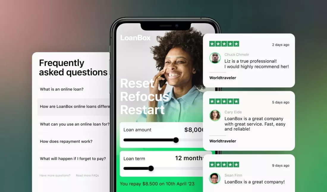
#6. Increase trust by adding reviews
Building trust is one of the essential tasks for a small loan website. One of the easiest ways to do it is by adding reviews. Nine out of ten customers say they check reviews before making a decision.
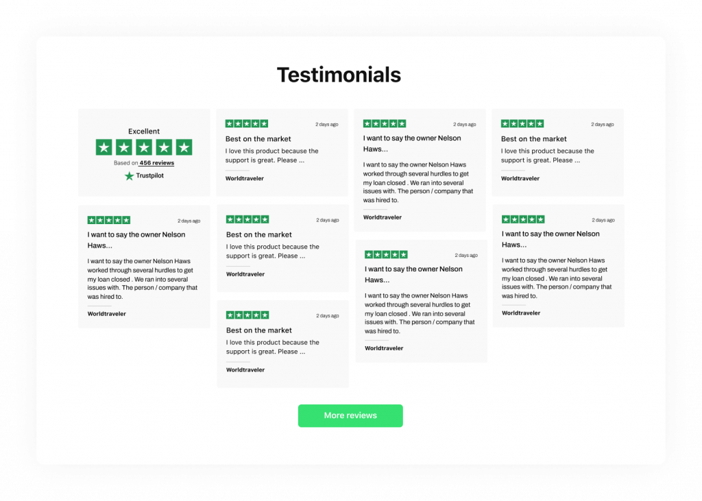
But be cautious. Statistics show that 62% of people avoid companies that censor their reviews. We recommend integrating your website with Google reviews, as it is the most popular online review platform.
#7. Make your offer clear and transparent by answering the FAQ
Another way to increase trust and make your offer more transparent is by answering the most common questions. You can make an FAQ block on your main page or create a separate page for them.
It will help you reduce the workload of your managers as they will get fewer calls and messages with repetitive questions. Also, such a page might increase the number of conversions, because knowing the answers to the most exciting questions will make it easier for people to trust the company and fill out the application form.
#8. Allow users to communicate with you easily
Even if you added all the blocks we mentioned before, you still need to leave your door open. Add chat functionality to your loan page and highlight the phone number, so users can contact you anytime they have questions.
Research shows that live chat (41%) and phone support (32%) are two of the most preferred types of communication among modern users. They also have the highest customer satisfaction ratings: 91% for phone support and 85% for live chat. As a result, implementing these features leads to significant positive effects on sales, revenue, and customer loyalty. 79% of surveyed businesses report about it.
#9. Add more pages to your website
When visiting a company’s website, people expect to see some specific information. The B2B Web Usability Report by Huff Industrial Marketing, KoMarketing, & BuyerZone shows that 52% of respondents want to see information about the company, and it’s the number 3 interest after the product or service information (86%) and contacts (64%). So even though there is no consensus about what is a better multi-page or single-page website, you still can consider adding more than one page to your website. Especially if you have a lot of information that you want to share.
#10. Don’t forget about mobile devices
Last but not least is the mobile version of the website for lending. Even though conventions on mobile devices are usually lower than on desktops, people still quite often do research using mobile devices. Moreover, mobile optimization is important if you want to show up on the Google search result page, as search engines use a mobile-first approach when ranking websites.
Where to start?
Keeping all these little details in your mind may be overwhelming. So to focus on more important for your business tasks, it’s better to delegate website design to professionals. You can hire a designer for a project or just choose a ready-made lending platform that will be customized according to your needs without any extra effort from your side. Share your ideas with our experts, and we'll build a high-quality landing page in compliance with all design requirements.
Ready to start? Get in touch with the team at HES FinTech.